The game’s underlying formal rules are done, and as I continue to work on presenting them, the time has arrived to figure out how Within My Clutches is going to look. Having failed to achieve any breakthrough in the realm of cheap boxing, my first visual design will be for a book. I’ll keep an eye on whether the look will also work for a boxed set, but I can’t let that issue stall my progress any more.
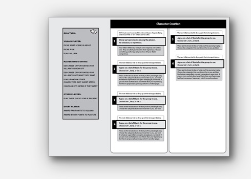
In defining the look of Within My Clutches, I’m grappling with various issues. I want it to be easy to scan, skim, and navigate, I want it to evoke superhero comics, and I want it to be consistent with whatever brand I develop for my games. I’ve worked through various ideas on those fronts, and this post is about the first idea I tried.
One of my passions in RPG gaming is a certain style of immersion — looking at the imagined events of play “up close, from within” as if you’re there, rather than “detached, from on high” as a story conference or script workshop. This is a major focus of my fantasy game in the works, Delve, and my cover draft reflects that:

My first thought for Within My Clutches was to again use a close-up photo. Not knowing where to find a photo of a supervillain, I decided to create one. With a close-up, a full proper costume wouldn’t be necessary — all I’d really need was a good mask on a model with the right expression. So, time to make a mask! I wanted something evocative of the ostentatious masks of Doctor Doom and Stryfe, while also a wee bit budget-crappy as a nod to the game’s humorous element. I found what I was looking for in a baking tray:

I sliced off the corners so I could flatten it out:

And had a friend take a photo to test whether the shiny metal could possibly work as a mask:

Deciding that there was hope, I got to work marking and cutting out eye holes. My first attempt was properly placed for sight and nothing else. I took another photo to help guide my fine-tuning:

Eventually, I got the eye holes the way I wanted them, and gave a nice grimace to demo the concept as a cover:

How would this look on a cover? Before pursuing a real, usable photo, I threw this one in a demo:

Despite not being 100% sold that this is the way to go, I liked it enough to try for a better shot. I don’t know any pro photographers nearby, and I’m trying to keep my expenses for this phase of the project as close to zero as possible, so I decided to see how close I could get to professional quality on my own. This consisted of many failed attempts where the camera angle wasn’t high enough, the light wasn’t sharp enough, and my expression didn’t read quite right:

Finally, though, we got one that had the right energy:

I imported this into Photoshop to see if it could be a contender. Alas, zooming in revealed that my digital camera just isn’t up to par, and that the cameraman was too far back to get a high-resolution image of the area I’d use:

Even so, I wanted to see how this would look as a cover. Although I’m not sure whether I should use this for anything, I’m quite fond of the result:

I let this simmer for a while as I worked on other stylistic concerns.